HAWKEN servers are up and our latest minor update is live!
Forgot Password_ SUPPORT REDEEM CODE

Jump to content


H.U.D Improvment


  • Please log in to reply
33 replies to this topic

#21 Gunmoku

Gunmoku

    Advanced Member

  • Full Members
  • PipPipPip
  • 551 posts
  • LocationThe mystical, magical land of Right Over There

Posted February 07 2013 - 07:10 PM

View PostKaszaWspraju, on February 07 2013 - 04:07 PM, said:

EDIT
Why resign with these great, fits perfectly to the whole Hawken, tag enemies and friends
Posted Image
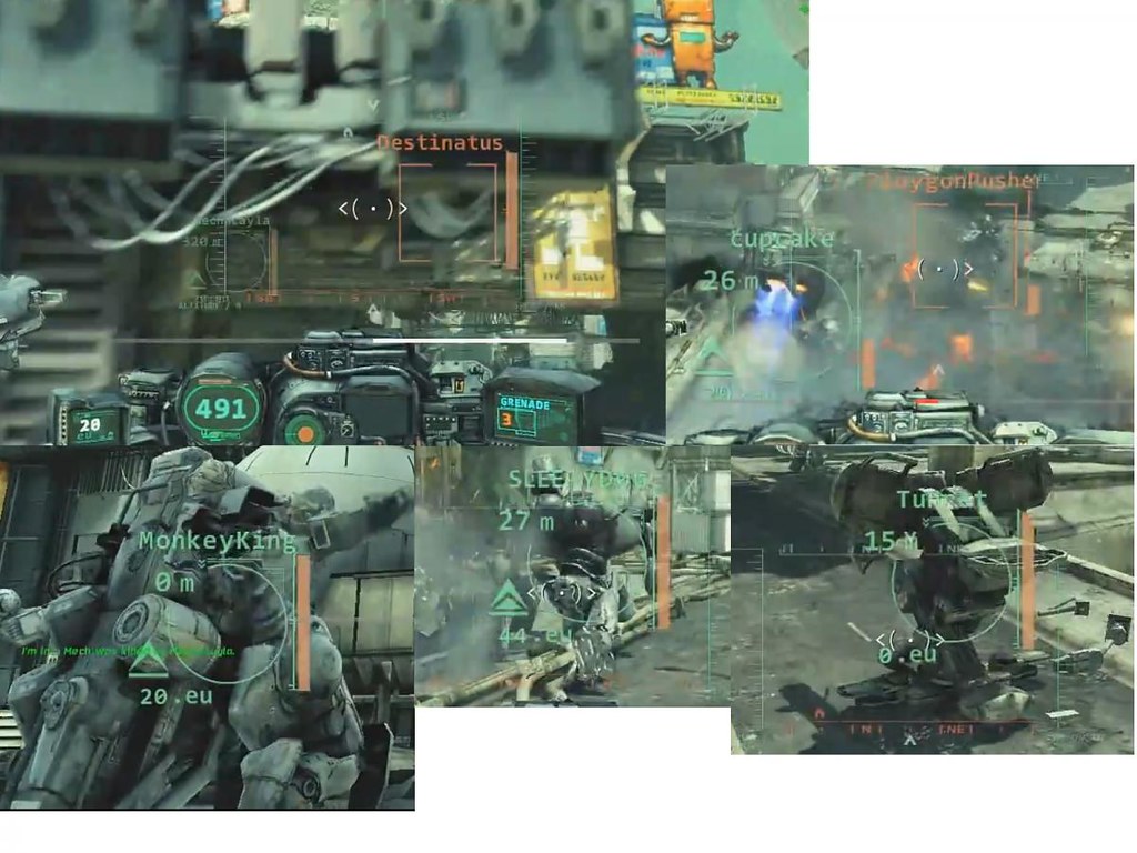
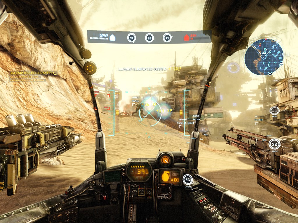
Here, much more clearly visible "odometer" and the amount EU he has.


@Beefsweat
I got this beast Mitsubishi Diamond Plus 230sb. 4:3 I play on 1600x1200.


There's an issue with that version of the HUD.  Look closely.  See how the text just about vanishes into the background textures_  In both graphic and UI design, it's a turn-off and a bit of a no-no.  You want vital information to pop off the screen or be very clearly legible, and the newer UI does it miles better than the pre-Alpha UI does in those pictures. Now it can still look like that UI design language just by changing fonts and texture overlays, but they need to be significantly brighter or on a slightly different color palette than the game textures, or they will still bleed into the background. The crosshairs and in-game indicators are all very muted and are very hard to read when put up against the in-game textures.  Actual jet fighter HUDs are super-bright and bold because of issues like that, the HUD can be lost against bright backgrounds like the sky or a solid colored piece of terrain.  The cockpit technically displays negligable information, save for current health and item CD time (which honestly need to move up towards the center more than they do now to prevent you from taking your eyes off the battle).

View PostRED_FIVE, on September 04 2013 - 08:20 PM, said:

YER A RAIDER, HARRY.

#22 KaszaWspraju

KaszaWspraju

    Advanced Member

  • Members
  • PipPipPip
  • 922 posts
  • LocationPoland

Posted February 08 2013 - 04:13 AM

This is just my opinion but I'd rather just older solution, the current is intrusive, obscures an important part of the screen, and gives too much non-essential information. Also pity that fits stylistically less total Hawken experience, went too far in the direction of usability, but as I said this is my opinion.

Edited by KaszaWspraju, February 08 2013 - 04:40 AM.

INTEL i5-4670K * ASUS Z87-A * GOODRAM DDR3 2x4GB * GIGABYTE GTX 760 OC rev 2.0 * X-Fi XTREME MUSIC * GRADO SR-60

SAMSUNG EVO 120GB * OCZ STEALTHXSTREAM 2 600W * Win 7 64
@ defekt : Mobility is King and burst damage is Queen. Checkmate.
Gdy byłem młodszy byłem bardziej beztroski... aha... nie lubię już POLSKI !


#23 Beefsweat

Beefsweat

    Advanced Member

  • Full Members
  • PipPipPip
  • 2,845 posts
  • Locationsan diego, usa

Posted February 08 2013 - 11:41 AM

View PostGunmoku, on February 07 2013 - 07:10 PM, said:

There's an issue with that version of the HUD.  Look closely.  See how the text just about vanishes into the background textures_  In both graphic and UI design, it's a turn-off and a bit of a no-no.  You want vital information to pop off the screen or be very clearly legible, and the newer UI does it miles better than the pre-Alpha UI does in those pictures. Now it can still look like that UI design language just by changing fonts and texture overlays, but they need to be significantly brighter or on a slightly different color palette than the game textures, or they will still bleed into the background. The crosshairs and in-game indicators are all very muted and are very hard to read when put up against the in-game textures.  Actual jet fighter HUDs are super-bright and bold because of issues like that, the HUD can be lost against bright backgrounds like the sky or a solid colored piece of terrain.  The cockpit technically displays negligable information, save for current health and item CD time (which honestly need to move up towards the center more than they do now to prevent you from taking your eyes off the battle).

Pretty much this. I can't tell what the fudge is going on with the HUD in those screenshots, especially because I am red/green colorblind... the current iteration of the game is a bit more legible, IMO.
Posted Image

#24 KaszaWspraju

KaszaWspraju

    Advanced Member

  • Members
  • PipPipPip
  • 922 posts
  • LocationPoland

Posted February 08 2013 - 04:26 PM

View PostBeefsweat, on February 08 2013 - 11:41 AM, said:

Pretty much this. I can't tell what the fudge is going on with the HUD in those screenshots, especially because I am red/green colorblind... the current iteration of the game is a bit more legible, IMO.

OK but for colorblind should be a special option in the options of graphics, a lot of games it exists already.

I Please only for option on / off for those who want to enjoy 100% of the ridge mech, being in cockpoit, who want complete immersion in the game, and these things just removed here.

INTEL i5-4670K * ASUS Z87-A * GOODRAM DDR3 2x4GB * GIGABYTE GTX 760 OC rev 2.0 * X-Fi XTREME MUSIC * GRADO SR-60

SAMSUNG EVO 120GB * OCZ STEALTHXSTREAM 2 600W * Win 7 64
@ defekt : Mobility is King and burst damage is Queen. Checkmate.
Gdy byłem młodszy byłem bardziej beztroski... aha... nie lubię już POLSKI !


#25 Mech__Warrior

Mech__Warrior

    Advanced Member

  • Members
  • PipPipPip
  • 180 posts

Posted February 08 2013 - 07:39 PM

View PostThe_Silencer, on February 07 2013 - 05:24 PM, said:

View PostHouruck, on February 07 2013 - 04:45 PM, said:

View PostThe_Silencer, on February 07 2013 - 11:00 AM, said:

That's a lack of respect so be welcome to my steel ignore list. Thanks.
I had no intention to be disrespectful. And maybe we misunderstand each other. Please take note that english is not my native language and I was short because I wrote that from my workplace (and also it is 1:44 am here now :D).

I definitely missunderstood you. Thanks for clarifying, mate. Now get out of my Ignore List! :D

Stop living up to your name, and being so damned thin-skin.  I hate people who make it seem like you're walking on eggshells with them.  Boo hoo.
Posted Image

#26 RudaForce

RudaForce

    Advanced Member

  • Members
  • PipPipPip
  • 225 posts
  • LocationBC Canada

Posted February 08 2013 - 10:54 PM

Gah, the blue orbs! I can't see a thing! +1

Posted Image

"I don't have a favourite quote."


#27 KaszaWspraju

KaszaWspraju

    Advanced Member

  • Members
  • PipPipPip
  • 922 posts
  • LocationPoland

Posted February 09 2013 - 05:46 AM

View PostScapes, on February 08 2013 - 05:45 PM, said:

Open Beta Patch Notes: 02/12/13
  • Reticle improved to be more accurate. As a result, the optional setting for Accurate Reticle (Experimental) has been removed.
  • Fixed XP bonus indicators being left as bright blue orbs in-game.
  • Improved kill and death messages in the mech HUD.
You can see that the changes are coming for the better,

INTEL i5-4670K * ASUS Z87-A * GOODRAM DDR3 2x4GB * GIGABYTE GTX 760 OC rev 2.0 * X-Fi XTREME MUSIC * GRADO SR-60

SAMSUNG EVO 120GB * OCZ STEALTHXSTREAM 2 600W * Win 7 64
@ defekt : Mobility is King and burst damage is Queen. Checkmate.
Gdy byłem młodszy byłem bardziej beztroski... aha... nie lubię już POLSKI !


#28 cpl_bradders

cpl_bradders

    Advanced Member

  • Members
  • PipPipPip
  • 221 posts
  • LocationUK

Posted February 09 2013 - 10:42 AM

View PostKaszaWspraju, on February 07 2013 - 06:53 PM, said:

Something came over me, looking at old videos of the game, hud was, something like a military green color (crosshair). Now we have bright neon colors. Generally then the colors were more toned, not so brilliant, which I think is better suited for Hawken.

Do you mean like this Kasza_

[media][media]

If so we are pretty much two of a kind as far as aesthetics goes :)

Edited by cpl_bradders, February 09 2013 - 10:43 AM.

Operation of this mech binds you to the terms outlined in the Life/Death Policy Agreement, Section 2.

You are immediately liable for any and all damage incurred to this mech.


#29 KaszaWspraju

KaszaWspraju

    Advanced Member

  • Members
  • PipPipPip
  • 922 posts
  • LocationPoland

Posted February 09 2013 - 11:04 AM

Now for me this clip is HAWKEN P>O>R>N>! This climate, it's gone now, I play a good game, instead of playing Hawken.

Edited by KaszaWspraju, February 09 2013 - 11:07 AM.

INTEL i5-4670K * ASUS Z87-A * GOODRAM DDR3 2x4GB * GIGABYTE GTX 760 OC rev 2.0 * X-Fi XTREME MUSIC * GRADO SR-60

SAMSUNG EVO 120GB * OCZ STEALTHXSTREAM 2 600W * Win 7 64
@ defekt : Mobility is King and burst damage is Queen. Checkmate.
Gdy byłem młodszy byłem bardziej beztroski... aha... nie lubię już POLSKI !


#30 Kazma

Kazma

    Advanced Member

  • Members
  • PipPipPip
  • 609 posts
  • LocationGermany - Leipzig

Posted February 09 2013 - 02:41 PM

View PostKaszaWspraju, on February 07 2013 - 04:07 PM, said:

Kazma killed Luckyfish.Posted Image
I KILLED HIM :D
Posted Image
pm me for hire :)

#31 Onebullit

Onebullit

    Advanced Member

  • Full Members
  • PipPipPip
  • 1,310 posts
  • LocationBelgium

Posted February 13 2013 - 01:27 PM

View Postcpl_bradders, on February 09 2013 - 10:42 AM, said:

View PostKaszaWspraju, on February 07 2013 - 06:53 PM, said:

Something came over me, looking at old videos of the game, hud was, something like a military green color (crosshair). Now we have bright neon colors. Generally then the colors were more toned, not so brilliant, which I think is better suited for Hawken.

Do you mean like this Kasza_

[media][media]

If so we are pretty much two of a kind as far as aesthetics goes :)

I have watched videos like this over and over again and still can't understand why they have changed the sounds.
The game sounded so much better.

Edited by Onebullit, February 13 2013 - 05:15 PM.

><(((((°> - - - - - - - - - - -  ><((°> ><((°> ><((°>

HAЩKEИ ---> hawken

Member of: Critical Assist


#32 ShadowGTR

ShadowGTR

    Advanced Member

  • Full Members
  • PipPipPip
  • 1,034 posts
  • LocationArizona

Posted February 26 2013 - 03:46 PM

I just noticed something. I can see a lot more of the inside of the cockpit in these pictures than I can on my own monitor. Take the A - Class, for instance. That area above the site markers and base HP, and all those buttons on the bottom, I can't see those on mine. Is this due to a higher resolution_ Mine is running at 1920x1080.

Posted Image


#33 TheLostVikings

TheLostVikings

    Advanced Member

  • Members
  • PipPipPip
  • 118 posts

Posted February 26 2013 - 04:04 PM

View PostShadowGTR, on February 26 2013 - 03:46 PM, said:

I just noticed something. I can see a lot more of the inside of the cockpit in these pictures than I can on my own monitor. Take the A - Class, for instance. That area above the site markers and base HP, and all those buttons on the bottom, I can't see those on mine. Is this due to a higher resolution_ Mine is running at 1920x1080.

You (like me) have a widescreen, those pictures are in portrait resolution.

Pretty sure that's the reason.

Almost sad I miss out on all those little details...

#34 KaszaWspraju

KaszaWspraju

    Advanced Member

  • Members
  • PipPipPip
  • 922 posts
  • LocationPoland

Posted February 26 2013 - 05:13 PM

View PostShadowGTR, on February 26 2013 - 03:46 PM, said:

I just noticed something. I can see a lot more of the inside of the cockpit in these pictures than I can on my own monitor. Take the A - Class, for instance. That area above the site markers and base HP, and all those buttons on the bottom, I can't see those on mine. Is this due to a higher resolution_ Mine is running at 1920x1080.

I got this beast Mitsubishi Diamond Plus 230sb. 4:3 I play on 1600x1200.

INTEL i5-4670K * ASUS Z87-A * GOODRAM DDR3 2x4GB * GIGABYTE GTX 760 OC rev 2.0 * X-Fi XTREME MUSIC * GRADO SR-60

SAMSUNG EVO 120GB * OCZ STEALTHXSTREAM 2 600W * Win 7 64
@ defekt : Mobility is King and burst damage is Queen. Checkmate.
Gdy byłem młodszy byłem bardziej beztroski... aha... nie lubię już POLSKI !


1 user(s) are reading this topic

0 members, 1 guests, 0 anonymous users