


 SirCannonFodder, on February 27 2013 - 03:30 PM, said:
Basically, yeah. Feel free to ignore me at this point if you think I'm being too pushy or nitpicky, but I've got a few more suggestions:
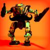
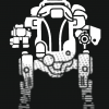
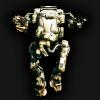
-Don't know how easy it would be, but maybe flip the gun part (the part sticking out of the top of the fist) around so the long part of the ammo magazine is over the thumb instead of over the fingers_ (or maybe switch the long and short parts of the magazine_) Might help make it look more balanced.
-In the original, the it looked like level of detail on the gun part was a bit higher, I think that worked better because it made it clearer it was a gun. Changing it back to like that (but leaving the barrel as it is now) might be good.
-In the Red Faction logo, they've got stencil lines between the hammer and the hand. Maybe do the same with yours_ (Not sure on this one, might work, might not)
Again, these are just suggestions, so if you try them and find they don't look good, feel free to ignore them.
Edited by L33TG33K, February 27 2013 - 04:34 PM.


 Thanks for all the awesome designs, Erathic! D:


 Anyways I’m sure you’re getting tired of people telling you how great you are so I’ll get back to whatever it is I do...


