 L33TG33K, on February 27 2013 - 02:21 PM, said:
SirCannonFodder, on February 27 2013 - 02:02 PM, said:
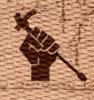
The barrel itself, particularly the part that overlaps with the hand. Making it more like a stencil like in the
Red Faction logo might work. I'd also recommend moving the whole gun further towards the knuckles, when you hold something clenched in a fist your fingers cover as much of it as they can, having it sort of daintily held by the first two fingers just looks weird.
So something like this_
Basically, yeah. Feel free to ignore me at this point if you think I'm being too pushy or nitpicky, but I've got a few more suggestions:
-Don't know how easy it would be, but maybe flip the gun part (the part sticking out of the top of the fist) around so the long part of the ammo magazine is over the thumb instead of over the fingers_ (or maybe switch the long and short parts of the magazine_) Might help make it look more balanced.
-In the original, the it looked like level of detail on the gun part was a bit higher, I think that worked better because it made it clearer it was a gun. Changing it back to like that (but leaving the barrel as it is now) might be good.
-In the Red Faction logo, they've got stencil lines between the hammer and the hand. Maybe do the same with yours_ (Not sure on this one, might work, might not)
Again, these are just suggestions, so if you try them and find they don't look good, feel free to ignore them.


 I want It!!!!

 .
.


