

one of y'all arty people should make logos for the current clans (make them more different that what exists though)
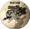
Sentium / Prosk Logo
Started by
erathic
, Feb 04 2013 12:38 PM
273 replies to this topic
#101
PlagueDoctor
-
- Members
-


- 389 posts
Advanced Member
Posted February 17 2013 - 10:24 AM
I think it is 1000's of money. IT IS 1000,s OF MONEY!!!.
#102
Giga_V_2
-
- Members
-
- 125 posts
Advanced Member

- LocationPhilippines
Posted February 18 2013 - 02:24 AM
I named my Rocketeer Walking Fortress too! 

#103
Galvanar
-
- Members
-
- 80 posts
Advanced Member
- LocationNew Brunswick, Canada
Posted February 18 2013 - 05:30 AM
LOVE them all!!!!!!!!
Had to come back for a second look. These are great.
I love seeing my SS on there.
Had to come back for a second look. These are great.
I love seeing my SS on there.
#104
Mech__Warrior
-
- Members
-
- 180 posts
Advanced Member
Posted February 18 2013 - 03:35 PM
Such beautiful work. Just goes to show, when you're a big fan of something, you can do amazing work.

#105
erathic
-
- Members
-
- 769 posts
Advanced Member
- LocationSentium Design HQ
Posted February 18 2013 - 04:30 PM
Hello and thanks for the feedback ! Sorry for the late update, i was busy..playing the game heeheee.
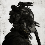
Here is an Infiltrator Wallpaper ! With a wall annnd .. a paper(poster) inside ouyeah.
Big version here : <link> i set the borders to black so you can put it centered on your desktop and use a black background to compensate the ratio. Also the "WANTED" Poster alone here : <link>
Hope's you like !

Here is an Infiltrator Wallpaper ! With a wall annnd .. a paper(poster) inside ouyeah.
Big version here : <link> i set the borders to black so you can put it centered on your desktop and use a black background to compensate the ratio. Also the "WANTED" Poster alone here : <link>
Hope's you like !

#106
Disrupted
-
- Members
-
- 87 posts
Advanced Member

- LocationEarth
Posted February 18 2013 - 04:44 PM
Heavens, it's my beloved Infiltrator!
Just splendid...an absolutely fantastic job...the colors, the shadows, the badass poster...truly remarkable. I'm once again amazed and even more astounded than before. You sir deserve more praise than ever possible on this forum and on this game; you've captured the very essence of badassery that I always pictured in my head with the Infiltrator. I'm still at a loss of words, overwhelmed with so many feels.
Bravo.
Edited by Disrupted, February 18 2013 - 04:50 PM.
#107
TazzGo
-
- Members
-
- 378 posts
Advanced Member

- LocationÉire
Posted February 18 2013 - 04:51 PM
Great work man! Love the Inf poster XD

#108
Cpt_Kill_Jack
-
- Full Members
-
- 1,651 posts
Advanced Member

- LocationCastle Rock, CO
Posted February 18 2013 - 05:11 PM
Crion FTW.

#109
tman7919
-
- Members
-
- 1,247 posts
Advanced Member
- LocationIn the garage with my Bruiser
Posted February 18 2013 - 08:00 PM
I am having a... Arrg! Uggh... so good... this Hawkgasm is driving me insane...
Bruiser or Bust! (Why do I have a raider in this picture_)

My Youtube With Hawken Videos Hawken Fan-fiction
My Youtube With Hawken Videos Hawken Fan-fiction
#110
erathic
-
- Members
-
- 769 posts
Advanced Member
- LocationSentium Design HQ
Posted February 19 2013 - 01:52 AM
Hehe thanks ! Oh and by the way on the Poster the 1 Million EU reward is in Energy Unit, not EUros
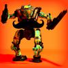
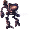
Here's a work in progress of mimimal illustrations/icons for the others mechs. Can you guess them (and their weapons) easy enough_

Here's a work in progress of mimimal illustrations/icons for the others mechs. Can you guess them (and their weapons) easy enough_
#111
TerranCmdr
-
- Members
-
- 534 posts
Advanced Member

- LocationSan Francisco
Posted February 19 2013 - 07:48 AM
Brawler and Rocketeer, very cool!
Awesome Sentium logo in my avatar by erathic
#112
Juodvarnis
-
- Members
-
- 1,126 posts
Advanced Member
- LocationGrand Duchy of Lithuania
Posted February 19 2013 - 07:54 AM
 TerranCmdr, on February 19 2013 - 07:48 AM, said:
Brawler and Rocketeer, very cool!

*sigh*
#113
Cpt_Kill_Jack
-
- Full Members
-
- 1,651 posts
Advanced Member
- LocationCastle Rock, CO
Posted February 19 2013 - 09:24 AM
Could you do some more with the Crion. I would love to use a crests like you have made for Sentium and Prosk.
#114
Siolo
-
- Members
-
- 4 posts
Newbie
Posted February 19 2013 - 12:40 PM
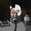
Okay, I'm trying my hand at this. I drew this mech with pencil and then did some layered ink work with brush and india ink. I wanted to feel kind of organic and gritty. I'm not convinced that I used the right font for the Sentium bit. Maybe I'll go find some better fonts.

Attached Thumbnails
Edited by Siolo, February 19 2013 - 12:43 PM.
#115
davek1979
-
- Full Members
-
- 1,146 posts
Advanced Member

- LocationAt the table, eating Cupcakes for breakfast...
Posted February 19 2013 - 02:12 PM
Siolo, on February 19 2013 - 12:40 PM, said:
Okay, I'm trying my hand at this. I drew this mech with pencil and then did some layered ink work with brush and india ink. I wanted to feel kind of organic and gritty. I'm not convinced that I used the right font for the Sentium bit. Maybe I'll go find some better fonts.
This is awesome mate, great work! Although I'd personally like to see it on a plain background, that round shape doesn't fit it very well.
"Mega-damage is systematically dismantling this game." - waftycrank. QFT. (http://community.pla...er/#entry224885)
[font=play, helvetica, arial, sans-serif]If we spread out, we die.[/font]
[font=play, helvetica, arial, sans-serif]If we stick together, we die together. (in memory of f_error, gone, but not forgotten)[/font]
[font=play, helvetica, arial, sans-serif]If we spread out, we die.[/font]
[font=play, helvetica, arial, sans-serif]If we stick together, we die together. (in memory of f_error, gone, but not forgotten)[/font]
#116
Siolo
-
- Members
-
- 4 posts
Newbie
Posted February 19 2013 - 02:25 PM
Thanks davel1979! I made it round because I thought it might be a cool sticker - the piece of board this is drawn on is rectangular. This is what it looks like without photoshop filters:

#117
erathic
-
- Members
-
- 769 posts
Advanced Member
- LocationSentium Design HQ
Posted February 19 2013 - 02:49 PM
Siolo, on February 19 2013 - 02:25 PM, said:
Super mech art
Wow very cool ! The use "real tools" + digital tools works very well to bring thing gritty touch you are after ! The PS filtrer works nicely, however i preffer it without the "Sticker" effect ( personally I would preffer to have this framed on a wall, than as a sticker )
Also the digital typo is contrasting a lot, maybe if you lettering something by hand too (on a separate piece of paper) then put it together in PS, would be much nicer / seamless.
Cpt_Kill_Jack, on February 19 2013 - 09:24 AM, said:
Could you do some more with the Crion. I would love to use a crests like you have made for Sentium and Prosk.
Oh i totally forgot about Crion LoL thanks for the reminder !
Here's a (shiny) try :

There maybe too much contrast between the very "futuristic" look of the typo VS the kinda oldschool emblem, but i did not had much ideas to merges theses better. I made it shiny to picture the early "Golden Age" of the compagny wich was at her time the very pioneer of Illal energy harvesting, until they consumed themselves. have you noticed the negative eagle face_
#118
Siolo
-
- Members
-
- 4 posts
Newbie
Posted February 19 2013 - 03:05 PM
erathic, on February 19 2013 - 02:49 PM, said:
Siolo, on February 19 2013 - 02:25 PM, said:
Super mech art
Wow very cool ! The use "real tools" + digital tools works very well to bring thing gritty touch you are after ! The PS filtrer works nicely, however i preffer it without the "Sticker" effect ( personally I would preffer to have this framed on a wall, than as a sticker )
Also the digital typo is contrasting a lot, maybe if you lettering something by hand too (on a separate piece of paper) then put it together in PS, would be much nicer / seamless.
Cpt_Kill_Jack, on February 19 2013 - 09:24 AM, said:
Could you do some more with the Crion. I would love to use a crests like you have made for Sentium and Prosk.
Oh i totally forgot about Crion LoL thanks for the reminder !
Here's a (shiny) try :
There maybe too much contrast between the very "futuristic" look of the typo VS the kinda oldschool emblem, but i did not had much ideas to merges theses better. I made it shiny to picture the early "Golden Age" of the compagny wich was at her time the very pioneer of Illal energy harvesting, until they consumed themselves. have you noticed the negative eagle face_
Hey erathic - thanks for the feedback! Hand lettering could be kind of bad ass. I tend to be a traditional artist anyway. I'll give that a try.
Thanks for the feedback.
I really like the newest Ciron logo. It is pretty shiny but I can imagine it as a guild bar sign or something. The crest itself is awesome. I could see that and the font as a wrist tattoo... or back of the neck...
#119
RavenCaspian
-
- Members
-
- 65 posts
Advanced Member

- LocationSentium
Posted February 19 2013 - 03:13 PM
I messed up my computer from puking rainbows.
I can't wait to see one for the Brawler.
I can't wait to see one for the Brawler.
 The lazy slacker...
#120
Cpt_Kill_Jack
-
- Full Members
-
- 1,651 posts
Advanced Member
- LocationCastle Rock, CO
Posted February 19 2013 - 03:42 PM
erathic, on February 19 2013 - 02:49 PM, said:
Siolo, on February 19 2013 - 02:25 PM, said:
Super mech art
Wow very cool ! The use "real tools" + digital tools works very well to bring thing gritty touch you are after ! The PS filtrer works nicely, however i preffer it without the "Sticker" effect ( personally I would preffer to have this framed on a wall, than as a sticker )
Also the digital typo is contrasting a lot, maybe if you lettering something by hand too (on a separate piece of paper) then put it together in PS, would be much nicer / seamless.
Cpt_Kill_Jack, on February 19 2013 - 09:24 AM, said:
Could you do some more with the Crion. I would love to use a crests like you have made for Sentium and Prosk.
Oh i totally forgot about Crion LoL thanks for the reminder !
Here's a (shiny) try :
There maybe too much contrast between the very "futuristic" look of the typo VS the kinda oldschool emblem, but i did not had much ideas to merges theses better. I made it shiny to picture the early "Golden Age" of the compagny wich was at her time the very pioneer of Illal energy harvesting, until they consumed themselves. have you noticed the negative eagle face_
Could I get that in 1920x1080 please_


1 user(s) are reading this topic
0 members, 1 guests, 0 anonymous users


