


Post facility Update :
Immersive HUD suggestion

Old
Spoiler
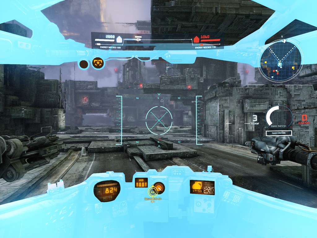
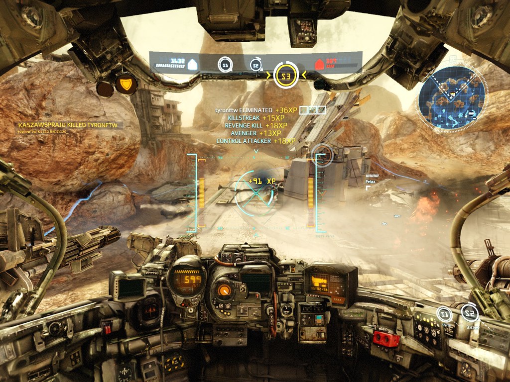
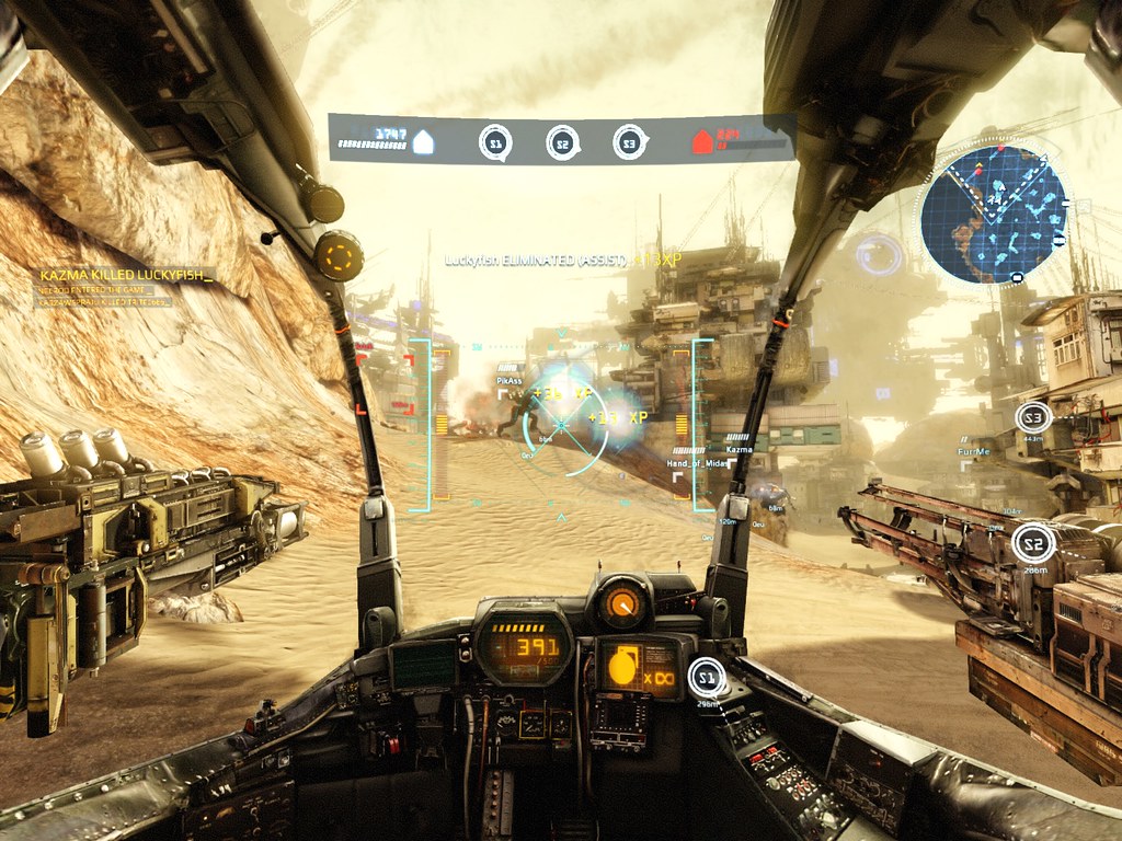
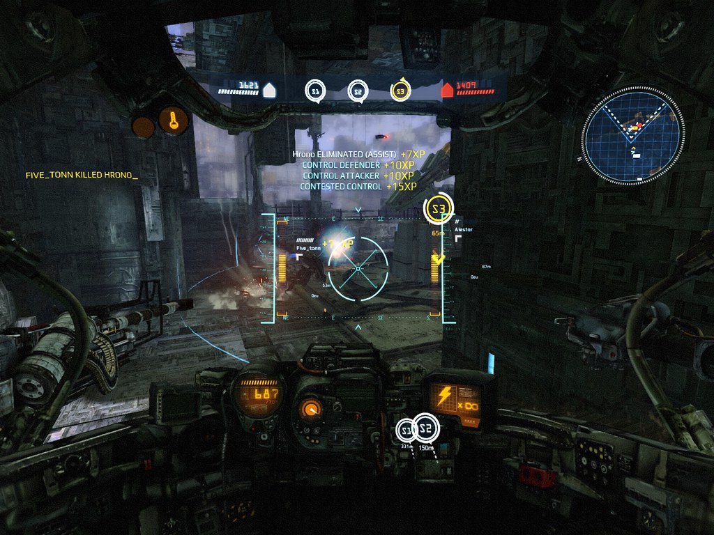
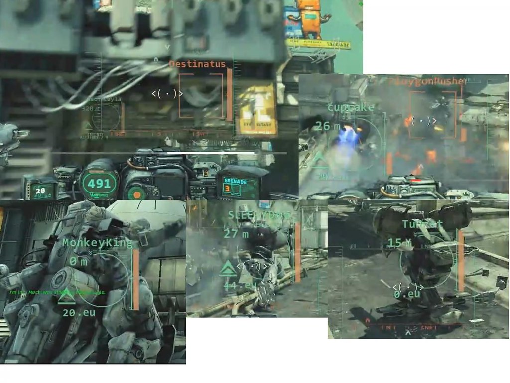
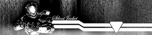
i know that the "menus all over the screen" is somehow part of the "mech" experience and feel, but i find it very obtrusive, to the point that sometimes it can be annoying during fights or and alter the visual experience of the real-time environement and action happening on-screen.I know the game is in beta and hopefully things will change, however here's a little sketch reflecting what i'm expecting for future HUD updates.
Global/ settings :

Old :
i know that the "menus all over the screen" is somehow part of the "mech" experience and feel, but i find it very obtrusive, to the point that sometimes it can be annoying during fights or and alter the visual experience of the real-time environement and action happening on-screen.I know the game is in beta and hopefully things will change, however here's a little sketch reflecting what i'm expecting for future HUD updates.
Global/ settings :
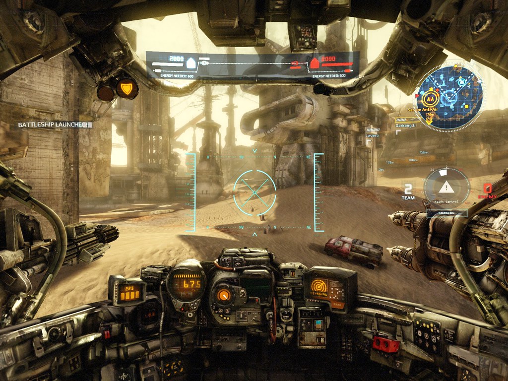
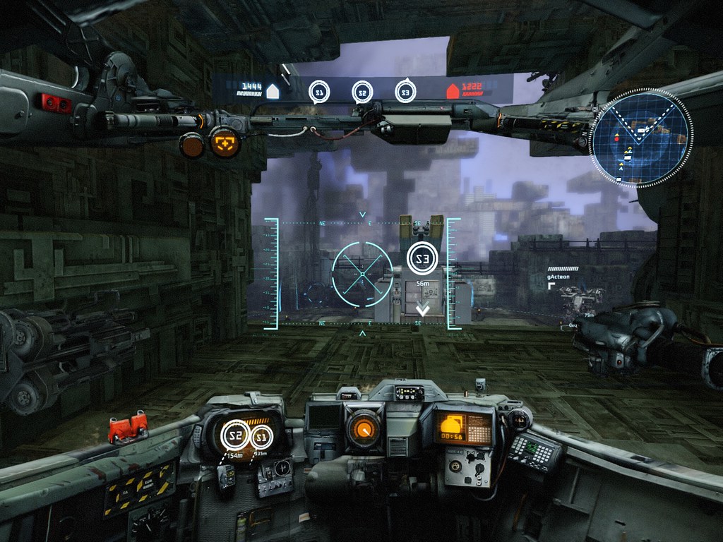
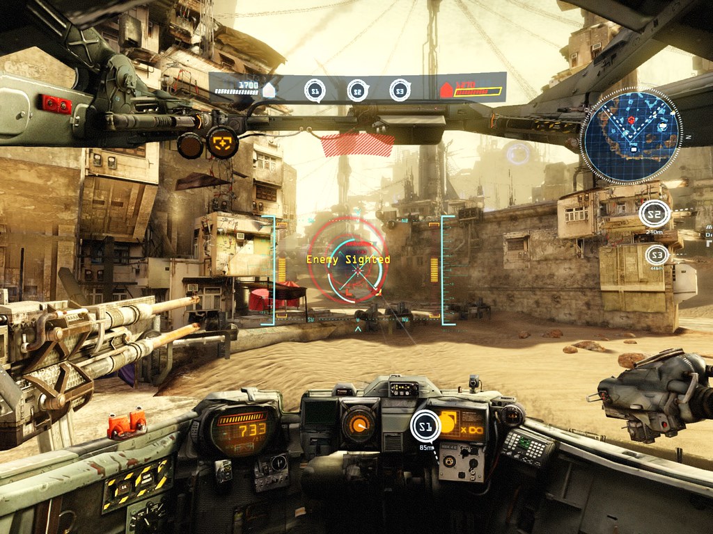
- Options (in the settings) to hide/display Killfeed and killmsg (xp gains)
- PER CLASS HUD, A-B-C class have minor graphical and positions variations
- Colorblind support (Beefsweat)
- Refine the "Enemy Sighted" marker (updated in the Tech patch!)
- Split tchat box and Killfeed
- Most HUD placed in less view-obtrusive positions (corners / over or integrated as cockpit elements)
- Add little transparency on all HUD elements
small Icons to replace "killed by" /suicides textreplace it with Mech type ie: SCT- Xp gains, etc.. Not in the critical line of sight
- Enemy spotting outline disappears as soon as the mech doing the spotting breaks line-of-sight. (WarlordZ)
- spotted enemies wich are out of sight and out of radar displayed on a border line of the radar(updated in the Tech patch!)
- Out of radar allies displayed on the same radar border line(updated in the Tech patch!)
- Better minimap (updated in the Tech patch!)
- Spotted : blink fast + an " ! " in the center
- Number of players in each team displayed at the side of the minimap
- Move some elements to the FULL MAP Interface (so it become for used/tactical)
- Numbered grid cells on the full map
- Less intrusive assets rendered on the HUD in Siege and MA modes(The_Silencer)
- Reinforcing the logics on when harvesting EUs and/or when to defend/dominate structures on the map, via graying out or higlighting the EU display and combining visuals in between HUD and radar in order to highlight actions to follow(The_Silencer)
- "noisy" wave-sounds and one flashing red circle into an integrated display in the cockpit to handle "incomings" (The_Silencer)
- Chassis type indicator (for mech recognition) (N0stalgia) (updated in the Tech patch!)
- Tactical and taunt command roses
- PER MECH HUD color choice (cost HC)
- HUD themes "skins" : Prosk/sentium, etc.. Clans skins maybe _ (Cost MC)
- Cockpit voices : Male / Female / Robot / Ellen McLain / etc.. (Cost MC)
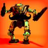
- Cockpit decoration: Laila bubblehead or (bikini) photo/ dangling dices/ Sentium energydrink can,etc..
Old :
Spoiler


 Green version
 Old suggestion:
Green versionOld suggestion:Edited by erathic, December 13 2013 - 11:22 PM.


 .
.


 Good work, I hope that someone from the Dev team to see this and draw conclusions.


