Some things I noticed:
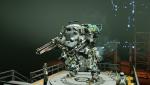
- Third person view during the barrier stage at the start of matches is disorienting. Not sure if this is the case for everyone. I'm guessing the idea was to let a player look at their new beautiful mech, but it gets old. Maybe include an option to disable it in settings.
- Cannot scroll down with mouse wheel in settings. I'm guessing it's because it's part of the old UI.
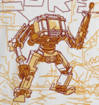
- Mech selection is hard to navigate. If the intention is to keep it, I would recommend defaulting the map zoomed in so people have a clearer initial read of what it is. You need to create the desire to explore rather than the desire to cope. Seeing the web bleed out of the edges of a screen would make me more inclined to look around or zoom out.
- Chat box no longer logs history. This makes it extremely difficult to follow typed conversations due to the difficulty in accessing the chat box regularly.
- The text box descriptions when hovering over items/internals/mechs with your mouse is redundant. I often found the box overlayed the description on the side. I would get rid of the hover description since it's less consistent.
- The back button is often misleading. For example, in the mech overview(?) page, you can access after initially clicking a mech on the mech selection menu, after clicking "weapons", you can no longer return to the overview page without returning back to the mech selection menu and clicking the mech again. I would rather there be more consistency between menu formats and easier navigation that is more practical.
- UI/Game is not optimized for 1900x1200, though this isn't too much of an issue since it never was.
Regarding aesthetics:
- The HAWKEN title overlay never seems to go away. I don't need to be reminded I'm playing HAWKEN all the time...
- Placement of menu items creates far too many visually disturbing tangents and/or spacing issues. Again, consistency is needed between each page and you need to make the mechs look more valuable. How do you expect to sell me something that's partially overlapped by a menu or pushed off to the side of my screen? Good composition requires a visual hierarchy. I can't even express my hatred for the lore/stats page...
- Lines bound every object, which makes everything look thick, especially when multiple bounded objects are next to each other. Group them together so bounding lines aren't so distracting. It's hard to read the text.
- The HAWKEN title overlay never seems to go away. I don't need to be reminded I'm playing HAWKEN all the time...
 Sign In
 Create Account


 Back to top