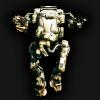


i'm enjoying playing it (even if i still not very good at it) I enjoyed the graphic novels as well and beyond that the game universe is so inspiring so as 'im also very pationate about graphic design, UI and UX i can't hold myself at imagining how i would twist and tweak it.
how i imagine with words the general UI experience :
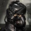
A holographic display, mechanical, futuristic and gritty because it's a mech game set in a post-apo universe
responsive and "fast" feel, almost aggresive, because it's a fast paced shooter game
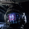
Here's a work in progress of this personnal interpretation :
As suggested later* i will add static and post effects in later updates
Sync screen and game-modes icons/ screen (on 1024 res) :


commo rose :

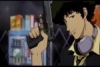
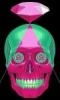
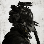
having big fun at it but i'm not yet happy about the style, i would like to make it less futuristic and a bit more "retro-futuristic" a bit like :

Edited by erathic, April 23 2013 - 02:14 AM.