man, I cant Quote Posts or using the Texteditor here at all, whats wrong with this Forum_
.
the latest HUD scetch is really dope, great layout ... but isnt it a bit ro much MWO like, with all the overlays_
.
as everyone is more or less analysing the HUD as one plays, here is what I got ...
.
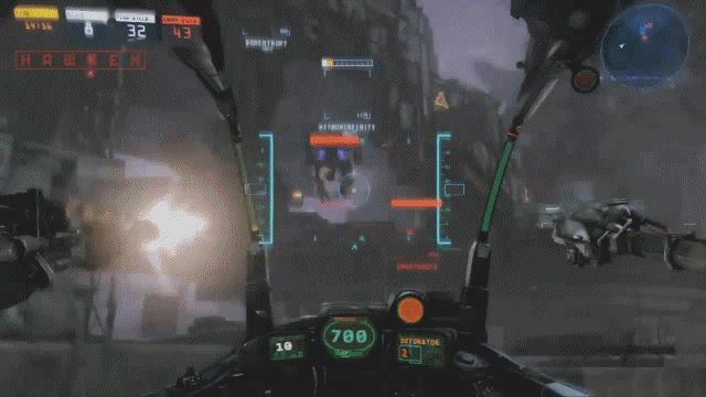
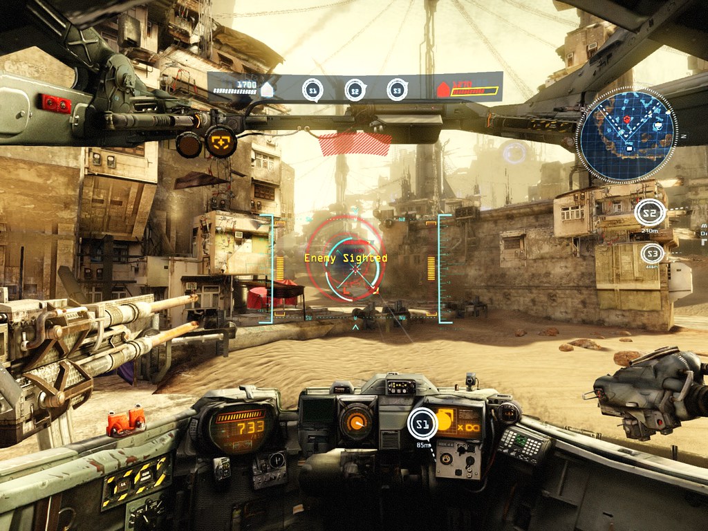
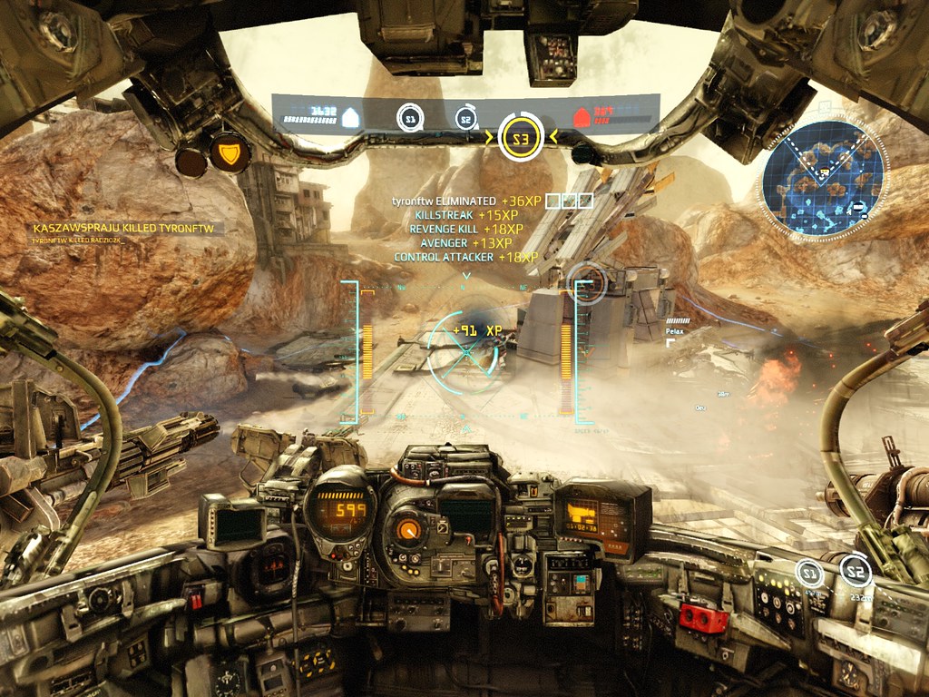
I think the current hud does a really great jop of centering all the importent information in the center of the screen, so you dont need to scan across the whole screen in order to collect the information, in fact all info regarding your mech and your own performence can
be reached by moving your eyes only a few inches away from the center of the screen ...
.
following that, the headindicators at the cokpit pillars is a bad idea ... even more if you think about that only a few players will use the maximum Field of view available and the pillars at least for the b-class are constantly moving outside the screen when dodging and moving in general ...
.
using a smaller FoV has the benefit that everything in the center of the screen becomes much bigger, better to aim at ... of course you trade overview at the borders of the screen for that effect ...
.
also the hawken UI is doing a great job in reducing the distration and clutter of on screen indicators and HUD
elements ...
.
.

.
so why not go even further and integrate even the match stats into the mechs own virtual cockpit _ keeping overlay style elements restricted to the area where the virtual cockpit of the mech is displaying its own HUD ..
.

can you spot the difference

.

.
.the game.mode.indiator area can also be used to Display the remaining time in Deathmatch
.
.greeting
Edited by Flagge69, March 20 2013 - 11:24 AM.


 erathic, on March 17 2013 - 01:34 PM, said:


