HAWKEN servers are up and our latest minor update is live!
Forgot Password_ SUPPORT REDEEM CODE

Jump to content


Another Garage Interface Overhaul suggestion (PICS) - Mech presets - numbers - etc..


  • Please log in to reply
67 replies to this topic

#41 erathic

erathic

    Advanced Member

  • Members
  • PipPipPip
  • 769 posts
  • LocationSentium Design HQ

Posted May 05 2013 - 12:15 PM

Thanks !

i updated the new design with light perspective effect (wich should de-active on hover for best readability)
added mech shop link under the toggle-able mech list
added back the mech presets quick-access

Also this new design is inspired a LOT by some of the diplays UI i saw in this video :
wich also contain some very cool HUD that could fit great in Hawken  isn't it_


Pics
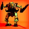
Basic mech infos view :
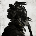
Posted Image

Mech stats tab ON :

Posted Image

Posted Image


#42 Sylhiri

Sylhiri

    Advanced Member

  • Full Members
  • PipPipPip
  • 3,135 posts

Posted May 05 2013 - 01:07 PM

Might want to make the windows a little less transparent so you can still see the text from the background (more so when you move your mouse around the mech). I will say the rounded top menu looks nice but it's a little disjointed from the lower windows because both the top and bottom windows are going in different directions.

Also the weapons window in KaszaWspraju's reply in my opinion looks better since it has more shape.

Edited by Sylhiri, May 05 2013 - 01:22 PM.

[13:14] <nonsiccus_work> uh oh

there's gravy in my keyboard

----------------------------------------------------------------------

[11:18] <+shosca> if you wanna play ar, go play zerker
[11:18] <Hyginos> and if you want to play zerker, go smc
[11:19] <someone> if you want to play sustain, please go and die in hell


#43 OdinTheWise

OdinTheWise

    Advanced Member

  • Full Members
  • PipPipPip
  • 2,596 posts
  • Locationsomewhere beyond time and space (-5 GMT)

Posted May 05 2013 - 01:19 PM

Tbh anything is better

because bow ties are cool


#44 Teljaxx

Teljaxx

    Advanced Member

  • Full Members
  • PipPipPip
  • 2,448 posts
  • LocationIn the thick of 8;;8

Posted May 05 2013 - 05:41 PM

Your UI designs were definitely reminding me of the ones in Oblivion, and now it makes sense why! That movie had some really nice looking UI designs. Nice, clean, readable, and futuristic.

I also agree that the angled windows on either side if the screen looks nice. It makes it look like you are either looking at a readout inside a helmet visor, or it is actually projected next to the mech in the garage. It makes it feel much more like you are actually in the garage with the mech.

View Posterathic, on May 05 2013 - 12:15 PM, said:

Posted Image

A suggestion for the bar at the top of this version: Having it curved does not fit right with the angled side windows. Instead, separate it into three sections, the middle one is flat, while the two sides are angled along with the lower side windows.
Always on the move / My trigger finger itches / If it moves, shoot it!  Posted Image8;;8

#45 Beefsweat

Beefsweat

    Advanced Member

  • Full Members
  • PipPipPip
  • 2,845 posts
  • Locationsan diego, usa

Posted May 06 2013 - 10:17 PM

This just keeps getting better and better... edit: I forgot to say that the colors on the most recent mockup are much more friendly with my type of colorblindness!

Edited by Beefsweat, May 07 2013 - 09:29 AM.

Posted Image

#46 Guest_waftycrank_*

Guest_waftycrank_*
  • Guests

Posted May 07 2013 - 06:23 AM

Do enjoy looking at these.  Area chart makes no sense tho.  Metrics aren't chartable in that way.

#47 Architect

Architect

    Member

  • Full Members
  • PipPip
  • 29 posts

Posted May 10 2013 - 12:55 AM

View Posterathic, on May 01 2013 - 04:11 PM, said:

Thanks for the replies,
well I sure did send an e-mail about this dream job oportunity, but things are a bit complex since i'm in france, have a job, sucks in engrish etc..
But I would really really love being more seriously part of this uber-awesome-adventure and team :P

aaanyway,

here's some less cluttered and new/casual player friendly updates,
thanks again for the feedback :)

Default garage panel, nothing much than the current one :

Posted Image


Classic mech customization panel :

Posted Image

Statistic tab enabled :

Posted Image

Advanced stats tabs dropdown : (still looks awefull, but in progress.)

Posted Image

I really like the type and color treatment on this version. Maybe a tweak in points size on the smaller stat text would make it a bit easier on the eye's or darken the background box a bit, but besides that its perfect. I would really like to see how you would handle other parts of the UI like the lobby room with an integrated chat box into the lobby lay out and not separated like it is right now.

Right now for me the UI is the only thing that is somewhat annoying me as it looks so simple and out of place for such a beautiful looking game.

Edited by Architect, May 10 2013 - 12:56 AM.


#48 erathic

erathic

    Advanced Member

  • Members
  • PipPipPip
  • 769 posts
  • LocationSentium Design HQ

Posted September 11 2013 - 02:56 PM

some more studies based on the latest UI heavily inspired by Oblivion UI

with little 3D effect

Posted Image


no effect

Posted Image

Posted Image


#49 Gunmoku

Gunmoku

    Advanced Member

  • Full Members
  • PipPipPip
  • 551 posts
  • LocationThe mystical, magical land of Right Over There

Posted September 11 2013 - 03:44 PM

View Posterathic, on May 01 2013 - 09:44 AM, said:

Unrivaled awesome...


Posted Image

Remind me again, why haven't you been banging on Adhesive's door for a job_

View PostRED_FIVE, on September 04 2013 - 08:20 PM, said:

YER A RAIDER, HARRY.

#50 onehourleft

onehourleft

    Advanced Member

  • Members
  • PipPipPip
  • 119 posts

Posted September 11 2013 - 06:56 PM

View Posterathic, on September 11 2013 - 02:56 PM, said:

some more studies based on the latest UI heavily inspired by Oblivion UI

with little 3D effect

Posted Image


no effect

Posted Image
Posted Image

Edited by onehourleft, September 11 2013 - 06:57 PM.


#51 erathic

erathic

    Advanced Member

  • Members
  • PipPipPip
  • 769 posts
  • LocationSentium Design HQ

Posted September 12 2013 - 12:03 AM

View PostGunmoku, on September 11 2013 - 03:44 PM, said:

Remind me again, why haven't you been banging on Adhesive's door for a job_

hehe because that said door is : 5,885.02 miles / 9.471,02 km too far to reach ( at this time ) and i'm not sure they want to/can handlie that from the distance. But something might be on the way =)

Thanks for the support ^^

Posted Image


#52 TheVulong

TheVulong

    Advanced Member

  • Full Members
  • PipPipPip
  • 3,797 posts
  • LocationRussia

Posted September 12 2013 - 12:38 AM

Oh, that sweet 3D effect..

Posted Image


#53 gingoku

gingoku

    Newbie

  • Members
  • Pip
  • 5 posts

Posted September 13 2013 - 01:38 AM

wow! Looks awesome!

#54 nepacaka

nepacaka

    Advanced Member

  • Full Members
  • PipPipPip
  • 4,762 posts
  • Locationin "KGB" headquarters, near with Baba Ji

Posted September 14 2013 - 12:39 AM

erathic, may I ask ... draw a couple of new reticule (Scope_ sorry Bad English :D)
and send it to developers.
really i dont joke =). You draw cool

#55 Shogun60

Shogun60

    Advanced Member

  • Members
  • PipPipPip
  • 112 posts
  • LocationNew Zealand

Posted October 06 2013 - 05:58 PM

Nice work either way Earthic keep it up Love the ideas
Posted Image

Looking for an organised HAWKEN clan_ visit http://TAW.net


#56 The_Silencer

The_Silencer

    Advanced Member

  • Full Members
  • PipPipPip
  • 9,266 posts
  • LocationStyx.

Posted October 06 2013 - 06:23 PM

Awesome, impressive and high quality work; Erathic!

Posted Image

.

"The difference between theory and practice is smaller in theory than it is in practice"


#57 InfiniteWin

InfiniteWin

    Advanced Member

  • Members
  • PipPipPip
  • 125 posts

Posted October 07 2013 - 12:10 PM

You should be hired automatically, make a kickstarter project for the community to help relocate you and your family to Team HWK.
InfiniteWin, winning all day, every day

#58 VYR3

VYR3

    Advanced Member

  • Full Members
  • PipPipPip
  • 180 posts

Posted November 25 2013 - 02:30 PM

This needs to go back to the main page, great things here.

#59 zaepp

zaepp

    Advanced Member

  • Members
  • PipPipPip
  • 230 posts
  • LocationGet to da AA!

Posted November 26 2013 - 04:13 AM

Every single one of these ideas is 1000 times better than what's currently in the game.

Edited by zaepp, November 26 2013 - 01:24 PM.

It's just the trees Johnny, just the trees ... (Unknown pilot after his first TDM on Last Eco)

Adapt or GTFO! (Unknown pilot after Steam FUBAR)


Enlist for competitive FarmVille today!  


#60 yoshimotosog

yoshimotosog

    Advanced Member

  • Full Members
  • PipPipPip
  • 404 posts
  • Locationin the great lands of lithuania

Posted November 26 2013 - 10:56 AM

dude, go to the devs, throw some printed copies of your work at their desk, kick the whoever made the asenction hood in the balls and take his place.

it is your destiny

Edited by yoshimotosog, November 26 2013 - 12:24 PM.

Posted Image


1 user(s) are reading this topic

0 members, 1 guests, 0 anonymous users